Wednesday, 23 November 2011

Student Website Analysis


I believe that this website is pretty good, the layout is simple and concise without being lacking. The artist's logo, album/single cover, music video as well as other images are all visible and nicely integrated as well as text.
There are a variety of font types (for example the logo and the tour date text) and links to other media, such as Facebook, MySpace and RSS feeds.
The photographs are an appropriate size and shape, nothing is overlapping where it shouldn't be and everything has it's place.
LEVEL 4

I like this website too because of the composition, and the way it appears that everything has been done from the ground up. The sketchy style is interesting, and the way it has been done shows technical skill.
There are plenty of hyperlinks to other pages and to other media i.e RSS feeds.
The blog posts down the centre work well, as does the music player at the top, though the positioning seems off, I do do wonder if it came off centre by accident at some point?
The fanbase login is a good idea, showing (if it worked) that the website would be technically complex.
As much as I like this website, there isn't any images of the band visible, so it misses out on some crucial marks.
LEVEL 2/3

Previous Student Website Analysis

I really like this website and I'd like to do something similar with our background as I like the  collage affect. The colours and clowns within the background add to the detail of the website so that it's pleasing for the eye. The layout of the website is not too over crowded and not too spacious, getting the right balance is essential and I think that they've balanced it quite well. Text sizes, font and colours vary throughout the website page. Appropriate language includes the basic words necessary on any web page, which they've included. The ICT skills shown are those on photoshop where they've created the background themselves and the importing of images upon the page. The integration of text and photos are of an equal level and indicate how the website appears quite professional. Images on the site include a mid shot of the band and a close up shot, both perfectly framed and sell the bands image to the target audience.


The website suits the target audience, it's bright colours and vibrant feel give it the 'pop' appeal. The website again uses the collage affect to capture all the images that the teenage girls target audience would appreciate to see. The selling of the image of the female is apparent with the big picture of her in the middle of the page. The writing is in white, block capitals and it's cracked effect looks different and it does look good but I feel a more feminine style of writing with swirls and not in capital's so it appears less aggressive will work better. The light pink middle background fits the general stereotypical female colour scheme and it brightens the page. Various writing texts are used which looks visually interesting. The ICT skills are of a high standard as it must've taken a lot of time to build up every layer and positioned them to look balanced. 

first day of filming video review

The video shows myself and Mitch talking to the camera about how we feel the first shoot went, we thought it'd be appropriate to film this in the woods where we finished shooting.

Tuesday, 22 November 2011

Alice from Crystal Castles Icon Costume Ideas


I will be performing in the video  when 'Alice' starts singing towards the end of the song and in random shots throughout and her iconic style needs to be captured on screen. So I will be sticking with her 'known' leather jacket throughout and having 'the grunge' style is very important. I therefore decided that netted tights and a casual-non revealing tshirt in black or a dark colour is essential. The logo tshirt below is beginning to be apart of the 'indie-raver' scene so I will wear a similar tshirt, with smoking and drinking being a key part of the photos for the digi packs.

Monday, 21 November 2011

Ethan Kath Costume Concept

I thought I'd look at as many images of Ethan online as I could to get a good idea of the type of clothing he wears within the band. What stuck out almost immediately was his choice of leather jackets, hoodies and jeans.

I wanted to emulate this kind of style in our video, so I chose a plain white t shirt, with a hoodie and black leather jacket (which I modified in my spare time to be slimmer fitting, like Ethan's) and blue wash slim/skinny jeans. I chose to wear some battered, dirty converse all stars I owned as he seemed to favour retro trainers and pumps and the grungy appearance of my all stars, in my opinion, fits the sub-genre they're placed firmly within, if not at the top of.

UPDATE:
Here I am with the hoody, jacket and a tee 'playing' my keyboard, and by that I mean pretending to.
And here's a lovely shot of mine and Sancha's feet. (Notice the shoes!)

Crystal Castles Wordle Review


It's an album review written by Emily Mackay off of the NME website, the picture as a whole sums up crystal castles in general. With bigger words like 'Synths,' 'sounds' 'debut' 'souls' 'Alice,' words that sum up the new album quite well.

Friday, 18 November 2011

CD COVER IDEAS

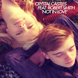
Using still taken on our first day of filming, i've been toying around with ideas for the CD cover, as we have yet to take the photographs we have planned for the digipak.
Here are some ideas:


In this design I thought it would be interesting to desaturate one half of the cover containing to male lead ('Robert Smith') to show the different colour filters we will be using within the video.

Wednesday, 16 November 2011

Filming Has Begun!


At the weekend we began filming the music video focusing on filming the flashback scenes within the video, here's a short behind-the-scenes trailer for the video using some of the footage we have so far, showing some of our locations, the actors, and make-up.

Font examples


This is  the normal Crystal Castles font which also works as their logo. It appears pretty basic but is quite effective. The shadows that slightly outline the title give it a precise and stand out effect. The idea of it being doubled just below could be because their band name has been the title for both of their albums so it's just functional to have it replicated. 


The font text below would work just as well if not better I think as their font style because it looks very urban, a bit run down but still not too over the top with the lettering. The fact that it's block writing in black, would suit their dark style. 


This font text similar to the original Crystal Castles text as it's all in block capitals. 


The font below is very different to their big, block capital font but I feel it could work just as well with it's thin lettering and messy randomly big in parts. It's quirky which is a word that would strongly describe Crystal Castles image. 


Tuesday, 15 November 2011

How I Feel The First Shoot Went

Forgetting the sparklers on my behalf was a bad start, but in the end we didn;t stay till it got dark anyway. So we will be filming that on a feild near the tunnel, which will look just as nice anyway. However we got a shot of the couple running without sparklers into the distance and I feel this was the best shot of the day. Sometimes spontanious ideas work out better than what are planned.
However waiting for the bus I thought of a location that was near by, accessible to the public location that looks urban and different where we could get a few nice shots for the flashbacks. It looked good on camera as it is a very grey looking background which contrasts nicely with the actors and their bright costumes. We got a lovely shot of them drinking from a bottle of beer together over a 'balcony' looking frame.
When we got to Wollaton Park the combination of the white balance and the light from the sun worked perfectly together so that the colours on screen shone out and made the happy flashbacks amazing visually. The mise-en-scene working well as by the time the sun had gone in a little bit we were filming the dark bit too our film with the argument and the woods made the scene look eerie and creepy. The woods a typical monster inspired home, so when the makeup was on the girl and she was in the woods it fitted nicely together. The actors worked well together and with direction from myself and Mitch they worked together with us to get the shots we wanted.
Afterwards I shot the clothed bath scene, which took several attempts but looking back the shot is exactly as imagined when storyboarding.
Overall we got 15 minutes of footage in one day which will need to be cut down drastically but we wanted to shoot lots so that we had a various amount of choices of flashbacks so that we are assured to have gained the most visually interesting shots that we could.

photos on shoot of male actor


I decided that whilst in the intresting feild and old brick backgrounds, that I should get some shots of the male actor for the CD cover and website. The lighting was really lovely which help the photos look as good as they do. The first one is slightly edited on the computer on a website called 'picnik' because I could tell it would look better if it was slightly cross processed. The other two I tried to frame it so that it was visually interesting and different. The use of the brick wall, rubble and beer bottle capture the typical male urban theme.

Pictures of actors together


These are some photo's I took whilst on the shoot of the actors together, so that we could print them off and use them on the first scene within the music video. As pictures of them together, we planned to have on the back of the door and the male looking at them and singing. Although their not a couple in real life as it is my boyfriend and best friend, I picked them because I trust them to be reliable for shoots and are both visually pleasing. With some motivation on my behalf and directing I told them how to pose for each shot, to create images that are believeable and look visually nice. The locations we picked were good settings for a young urban relationship that we are trying to capture within the video. I tried to get natural looking but generic affectionate romance with my photography and I hope this is proven within the photos above.

With every different shot I got the actors to put slightly different clothes on so that the photos looked different. When choosing the costumes, I wanted the happy flashbacks to have the actors in brighter clothing, so he wore the red jumper  and she wore a light denim jacket and lepoard print top, for the shots together on the wall. However when the bad flashback of the argument and chase he wore a navy shirt and cardigan and she wore a black leather jacket. Both outfits for male and female will suit the target audience's style and will hopefully be reflected and appreciated when the audience watches the finished video.

Shoot - Actress' Makeup


The before and after shots of the makeup, highlight how much of an impact it will be making on the music video as part of the conceptual idea when she turns around and her face is like this. Which previously described the idea I took from Health's video, we are water, so I took inspiration from the makeup used in that video. But I thought I'd put my own twist on the makeup by using white facepaint to give her a pale complexion which will make it seem eerie. The black rings around the eyes and around the mouth needed to resemble a monster but I used a slight red tint on the lips to keep a hint of normality. On camera the makeup looked really good and worked well with the planned camera shots as it was quite striking on screen.

Friday, 11 November 2011

first shoot on sunday

Scenes: bad running flashback in the woods, happy flashbacks, running with sparklers, bath scene.


Props: sparklers, still camera- (pictures of them together and male for cd cover- smoke flashback,) cigarettes, cheap cider, makeup and face paint for the girl horror shot, different clothing.

Costumes: both female and male will be wearing slightly different items of clothing for every different shot. Which will be visually interesting (bearing in mind the NVC) and will give the idea that 'the couple's' flashbacks will reflect a number of different occasions together. The happy flashbacks will have the actors wearing bright colours and the bad flashbacks will have them in dark colours. The costume colourswill then be a subliminal indication of how the characters in the video feel.

Locations: we will be going to Wollaton park and filming the flashback scenes.

Band Website Initial Designs

Summer Homework 2

This is the second summer homework done, this time on Crystal Castles. 

Digipak Design Template

This is the design for our digipak, featuring elements from our music video. 

Non Verbal Communication


Permission Form

inpsiration

The video 'Young Blood'


Summer Homework 1

This is the text and Scans from the Homework done over the summer, where I analyzed Kanye West.

Textual Analysis


Textual Analysis Sheets (HEALTH - Die Slow Video)

Thursday, 10 November 2011

Witch House Wordle

Whilst I was doing more research into Witch house and Drag I came across another article that better explains what the movement is. I thought it would be interesting to make a Wordle out of it.
It's quite interesting to see which words showed up the most, words like modern, passions, beauty, tense, awkwardness and dub are all words that one could use to describe the movement.
(Article found here: http://www.expatriarch.com/2010/05/trying-to-define-witch-house-can-be-a-real-drag/)