Tuesday, 7 February 2012

Evaluation Question 4


Question four: How did you use media technologies in the construction and research, planning and evaluation stages?
1.       A video with me discussing to the camera how I've created my digi-pack and music video and why I made the choices that I did and how I was inspired. 


Evaluation Question 3


Question three- We gathered our audience feedback by allowing them to watch what we had edited throughout the process and asking them how we could improve within the next shoot and then altering the story board to fit improvements. (WORDLE.) When it was made we then gave out questionnaires to understand what we could improve. The issues that arose were those concerning how the band were not shown maybe as much as they should have been. We didn’t story board them in as much, as we felt that as Robert Smith does sing throughout that it would be enough performance but some audience members said they would’ve liked to see a little bit more of them. We did include them where necessary like when Alice from the band sings at the end but the narrative of the video and the story of Robert we believe was more visually entertaining and that when we did show Crystal Castles it highlighted them as a band more. We could’ve involved more of a performance element but we felt it was a good balanced between performance and narrative and the problem of handing out questionnaires to the class is that, they may not fit the target audience of the band and might not like the genre of music thus not understand our ideas behind the narrative.
This is a wordle word cloud created from feedback I've been given from my music video and I like that the biggest and boldest words is that of 'good shots' which hopefully sums up the whole video. 

Evaluation Question 2


Question two: How effective is the combination of the main product and ancillary texts?

The album cover has an industrial/indie feel to it with the garage street background, the casual clothing and heads down. We took inspiration from this with our back cover beside the spray painted wood with us looking slightly down.


The website is very dark, mainly blacks and whites, which was what our wesbite consisted of too. It's simple too but effective, weve got a different layout with more happening to fit the purpose of our task. With the album covers on the front, we put ours on the website too and a tshirt with ourstyled wrting as apart of the merchandising.

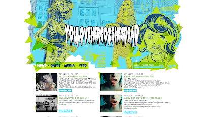
A similar band to ours 'You love her cos shes dead' it has an abstract feel to it with the big banner at the top of the website page making it clear to see that it's selling the band. We took this convention and gave our band a banner at the top, but instead ofit being a drawing we used a photograph that was of similar colours to the website. The also use the idea of having a 'news feed' which is used in ours as it means that the fans can keep up to date with the latest news of the band.

The album cover suits the unusual feel of the band, we originally wanted to use fake blood within our photoshoot for the album photos but decided that it didn't fit in with the rest of the package. However it works for this band, it's very eye catching which will help to sell the product, hopefully like our dolls head on our front cover.


A similar genre band M83 use a wood as their mise en scene for their front cover the soft, warm colours are similar to those on the front of ours. The convention of woods seem to appear often within this genre, as it appears to have an alternative working class feel. It seels the band as we see the 'cool but casual' clothing that they wear, which is important for the audience as they have to have a certain style to sell. We have also tried within our photoshoot to wear clothes that the fans will appreciate.


These are some key images from our music video that show the conventions of an  indie-electro band with its working class mise-en-scenes, the alternative shots that a band in the charts would not comply with.

These two shots are used to show a 'working class love,' that the audience can relate to.
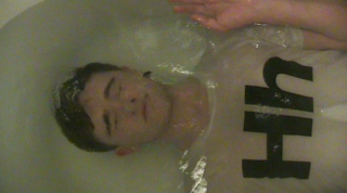
                                    
This type of shot is to suggest the realism of the situation so that the fans can relate. As it suggests that the band are ordinary people and get morbid feelings like anyone else thus the clothed bath, so it makes the band seem ordinary too which sells.


These three shots are ones that are used to sell the band and the close up, singing down the camera shots were used espeically to sell the band.

This shot is to sell Robert Smith to the audience, singing down the camera breaks the fourth wall and allows the audience to feel involved and he was doing it backwards to fit in with our going back through time theme.

This picture with it's close up on all of the band and Robert Smiths faces singing so that the audiene watching can feel as if they are singing through the camera to them. The brick wall within the background links in the website and cd case aswell.
This shot is trying to portray an argument between an normal couple, which is often hidden within the eyes of the media however we show it to show how down to earth the band are so it targets the audience as everyone has partners and goes through rough patches. The mise en scene of the woods is to add to the slightly dark feel that the band have.
This shocking shot captures the mind of the male and adds to the weird feel of the band and the video and it's similar to the idea surrounding the dolls head on the front on the CD cover, although they both have a slightly weird edge it seems to work with the band.
This image from the video maintains the theme of cigarettes which is a cultural link to the young working class indie-raver theme, which is a clear link to the smoking on the inside cover and on the front of the CD case and of the male in the band in the banner of the website with the cigarette in his mouth.
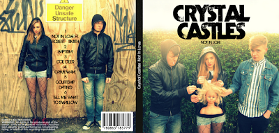


We’ve maintained a clear theme throughout to be of a brick wall, it’s relevant because it’s very working class which suits the target audience. The brick wall is part of the background on the website, is on two of the sides of the CD cover in the images and in the video it features with Crystal Castles and Robert Smith singing the chorus next to it, also within some of the flashbacks and when Robert Smith is walking backwards through the streets and sings beside some brick walls. We’ve tried to keep the sinister edge within the whole product, with a bizarre image of a dolls head within the hands of the band on the front cover of the album as it resembles the female within the video. The weird feel is kept within the video as a twist in the middle of the video, consists of an argument between the male and female, a chase scene and then the female turns around to look like a monster. The colouring within the CD package images fit in well with the colours of the loving flashbacks in the video and the sombre bits of the music video like the negative flashbacks and the male singing have similar colours to those on the website. The website, CD cover and the music video all have the purpose of selling the band with their edgy style, thus the run-down weird working class mise en scene’s  being a graveyard, a tunnel, a house and the streets. The whole package relates to the young adults of ages 15-21 by showing them smoking, drinking and partying as these conventions are typical for that age range. Within the music video it contains love scenes however it also shows the couple having an argument, which is realistic to life and suits the down to earth audience, as they would not have appreciated the ‘fairytale style’ conventions of love of a perfect couple happy and in love without showing the negatives of a relationship.
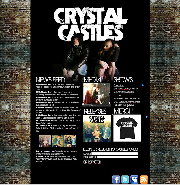
The website and CD cover promote the band by allowing the audience to see images that are similar to their everyday life, by hanging around in places around a city drinking and smoking. The website has the newsfeed which allows the audience to gain a better feel for the band and the facebook and twitter links help them to gain more insight into the band. This links with the singing down the camera lens as the audience feel like they can connect more so with the band, so they're key within the video.
All three products work together to show the edge of the band.

Evaluation Question 1


Question one: In what ways does your media product use, develop or challenge forms and conventions of real media products?
 Crystal Castles – Celestica
The video contains lots of mid shots whilst singing, walking along in the woods or in other urban working class looking areas. Throughout the singing contains cut aways of children dressed in black either playing instruments or playing, which provides an eerie weird twist to the video. One mise en scene particularly is that of a graveyard in some woods, it looks magical but has a sombre feel to look at. Some shots are that which have a pull focus or are just out of focus, which we have used also.


Health- We Are Water
This video which is of a similar genre to Crystal Castles is a video consisting only of narrative which is that of a horror film weird feel but it suits the music quite well. The mise en scene is of a dark forest with fog and snow throughout as well which adds to the eerieness.  The shot types vary so much that the it keeps the attention of the audience. The narrative is soley of a female running away in a mess with make up running down her face, from a scary looking bald topless man with a big sword in hand. This idea is very different and interesting to watch despite the fact that it doesnt have a performance element.


With inspiration from the We are Water video, in the middle of the video we decided to show the realism of the couple and not just the happy loving flashbacks, so they have an argument and we have various shots showing the couple running, as is done in the Health video. With inspiration from the female in We are water, I made our actrss have her facepainted to have a black and white face with it running over her face, as it is interesting to see as its different from the usual. We followed the conventional mise en scene of the band with the graveyard and forest theme used within our video as it is in theirs; too keep with the eerie feel of the band and with the lyrics. Within my video and the Crystal Castles videos, tracking shots are used of the singer to capture his singing. The conceptual idea within their video is the shots of the young children playing instruments and looking ghostly strange, so we wanted to capture a morbid story happening throughout our video which consists of the depression of the male and his lost love. We developed the conventions of a music video by integrating the conceptual story of him walking backwards and singing whilst having flashbacks of him and a female. Their videos captures a morbid feel with Robert Smiths sombre style; flashbacks of him sat in the bath clothed, arguing with the female and her then looking like a monster and her being sick, these integrated with the happy flashbacks work well together and it maybe challenges their normal conventions of a video as they don’t show any sign of happiness within their video. We have also challenged the conventions of a typical music video as it could be criticised that we have less of a performance involved, but we thought it important to gain a good story narrative to sell the band and the featuring artist. The health video proves that within the genre to have an interesting narrative with lots of different shots can be quite interesting to watch, they have no performance element  and it still sells the band to the type of audience we are aiming at. So in comparison to other bands within the genre we are quite fitting with the amount of performance, we have enough of the singing in the chorus’ and randomly throughout the video to maintain the interest of the audience. With the band featuring as buskers as Robert walking past them it gives the mysterious edge that they seem to have in their videos. We kept to close up shots whilst they sang as we understand that it’s essential for the artists to look into the camera and connect with the target audience. 


From feedback from the older generation I've been told it has an independent 80's music video feel, which is similar to videos from Joy division and The Cure, which is a post modern approach as these old bands are coming back into fashion and we've been told that we've captured this well. Although our video isn't performance based like Joy Divisions, it has a similar authentic quality with the way it is filmed, the setting of working class locations and the naturalness of the performers. 


Wednesday, 1 February 2012

Evaluation Question 4

On camera talk about:

DIGIPAK
When we worked on the digipak, inside and out, we payed attention to detail. We wanted everything about it to look both good, but also believable. We made sure that all the images used were a high quality and edited to suit the tone and style of our website and our video.
Similarly to other digipaks we looked at. We really liked the colours of Naked and Famous, yet we enjoyed the style and tone created on the Crystal Castles cover. (Show)
To do this we used:
  • Coloured filters on layers
  • Show an example of it (Ham & Lou pic)
  • sun bleaching at top (inside cover) 
We did this to keep the images consistent throughout. The front cover, which we made first, had the bleached effect at the top naturally, so to keep the entire digipak consistent we added that effect to the inside cover. 
  • editing the font
  • repeating/extending the images (brick pattern and tights) and warping (show example - bricks again)
(Show other digipaks)


IWEB
In iWeb we began with a basic, basic black template. It was decided early on that for consistency we'd keep the brick pattern a recurring theme. So we created the repeat background from a stock, royalty free image of an old factory wall, similar to the ones we wanted to use in our music video.
  • Repeat Pattern BG
  • Long-line design
(Consistent with other websites, such as YLHCSD and Unicorn Kid)
  • Editing the header with us as the band, overlapping the logo slightly and fading under the main content of the page, done in Photoshop.
  • 'blog'/news section links to merch media etc.
MUSIC VIDEO
  • Pasting over at playhead - we had some trouble with it at times, moving clips around without meaning too
  • editing the colours (party scene)
  • show an example of reverse a shot /slowing it down
  • planning the continuity
  • cut aways and rapid cuts
MODERN MEDIA
  • We used: iWeb, iMovie and Adobe Photoshop
  • Research: Youtube, spotify/last.fm for similar artists, television
  • Audience feedback: youtube again (we uploaded it to our own channel) and we intend on creating a small survey using Survey Monkey and posting a link to our peers on Facebook/Twitter
  • Due to Youtube's sense of synergy in modern tech/media it is easier now than ever before to distribute and cross-promote a product digitally quickly, cheapy and efficiently. Using social networking such as facebook, myspace, twitter and tumblr it is a simple task to get our video out to a wide audience.

Evaluation Question 1

1. In what ways does your media product use, devolp or challenge forms and conventions of real media products?
Decide whether your music video uses, devolps and/or challenges the forms and conventions of other music videos from your genre.

Our Video:

A Similar Video:


This video starts in a similar way to our video and has several key similarities, such as the way some of the shots are framed, the sunny beautiful location, and the general composition and mise-en-scene of the 'flashback' scenes. The tone if this particular video is happy or euphoric, which we wanted to emulate in those scenes.
We had not seen this video before planning our video, so when we did come across it and see the similarities, it confirmed my own personal belief that we were on the right path in terms of style and tone.

Another Crystal Castles Video:
Crystal Castles - Celestica


This is the latest official video made by the band themselves. We used a lot of similar imagry to them in terms of mise-en-scene, such as a graveyard and wildlife, as well as old-style buildings.
When we acted as the band we tried to style ourselves similarly as well. There are a lot of tracking shots through the locations in the video whilst Alice sings the vocals.

In all the videos we looked at and liked there was a strong visual style that was consistant thoughout the video, whether it be neo-goth like Crystal Castles or the Hipster/Indie style seen in the M83 video, we liked the consistency and wanted to replicate that in our video, as well as the general conventions of fast paced editing, a variety of shots lenghts, types and camera angles to keep the audience interested.

Audience Feedback Sheets


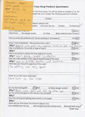
As a class we showed one another our projects and gave a quick review/piece of feedback to each other. These are the feedback sheets for our music video.
Most comments (though varying in specific marks/levels) agree with one another, most people liked and enjoyed the video however many felt there was some problems with the performance element in it. One group felt it wasn't enough, while another felt it was completely unnecessary. 

Thursday, 26 January 2012

music video finished


I am very happy with the completed video, it's changed a bit from what we had originally planned but for the better. 

Friday, 20 January 2012

Latest Video Shoot

I was unable to make it to the shoot at the weekend unfortunately, so we were unable to film any parts of the band performing.
Sancha, Hamish and Louise went and filmed in Nottingham however and got some amazing shots, plenty of happy flashbacks, cutaways and male performance, and several takes of them as well.
The lighting on the day with the sunlight was beautiful and I'm gutted I wasn't able to make it. Here's to hoping that it looks as nice next time we film!

The party scene - how we've used it


I was unhappy with the  various shots of the party scene, the lighting in the bedroom was very poor, we had enough people and the music speakers and equipment it just does not meet the standard of the rest of the clips as you can see.


However we are still going to use the bit of the couple and their role within the scene, we've brightened and contrasted the colours so that it looks less dark. Although party's are often in dark settings we want it to be bright enough to be seen. We won't be using the shots of the party people but as the ending part it works well. 

editing progress


As you can see above weve edited most of the footage, there is just a few blank spaces at the beginning and bout 30 seconds towards the end, that we are going to fill with the footage we get on sunday. We are planning on shooting 'Crystal Castles' busking, with lots of close ups of me singing the female lines at the end. We will also be wanting some panning shots to add to the movement within the shot types in the video. 

Shots I Like

I LOVE the composition and lighting here. The way the sun flares looks amazing.  This shot was taken on the shoot I wasn't at and I'm not affraid to say I'm jealous of the gorgeous locations and lighting.
This was a spontaneous shot on the day of our first shoot way back when. Just before we packed up and left our first (secret) location, I noticed the beer can and I thought a quick pull focus would fit with everything else we'd filmed. Fortunately a kind little ant decided to walk across the can as I filmed, it was too perfect.
This close up of Hamish's eyes looks great, and the way we edited it he looks down at the photo in his hands exactly on the beat. Completely accidental but brilliant.

Two of many shots that were reversed. The top one where Hamish walks out of the room (or into the room...?) we edited the colours slightly to add more contrast and saturation to the shots of the 'party' in the room. This was both to add to the contrast of emotions and locations, as it was because the shots were badly lit.
A high angle tracking shot was never going to be easy, however nice it sounded on paper. It took us many, many attempts but we got it, after making our actors run backwards and forwards several times and us taking it in turns to run after them, camera aloft. I love the final one shot, the way the actor and camera weave around trees is very visually engaging, I wish we'd planned more tracking shots into the video, the movement is gorgeous with the song we chose.
Finally, this is ironically one of the first things we filmed. While Sancha talked through what we planned to do with the actors on the day and took some still digital photos on location, I went around cradling the camera like a child made of glass and weaved about the place, hoping to get some nice looking cutaways and the shot we'd storyboarded in of the camera tracking forwards through some tall grass. I set the focus to very close to the camera itself (similar to a macro focus) in an effort to create something very visual.
I'd like to think I succeeded.

My favourite shots

A 'bad' flashback, I like the way she flings herself forward and the lamp-post light above them works well as it lights the area they're sat within the evening.


The shot of us three together works well as were diagonally facing the camera it looks better than if we had just stood in a line. It links the cd cover and website in, with the brick wall.